


Or certainly there’s no difficulty believing that it’s true, anyway.
Interesting little graph from the George Mason University Mercatus Center, which shows a lot of things. The thing that matters to most of us is the fact that the amount of your paycheck that you’ve been allowed to keep (the blue line) has trending steadily downward over the past 60 years or so, from almost 70% in the early 1950s, and approaching 50% now. Sweden, here we come. Yes, we can! Hide the decline!
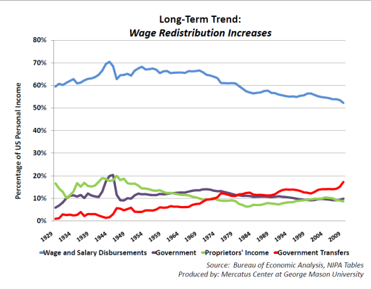
Also noteworthy is the red line – transfer payments. In more common English, this is “welfare”. While there’s been an uptrend over the entire period, it’s not hard to pick out certain features, including the LBJ “war on poverty” which almost doubled transfer payments in the mid ’60s to the mid ’70s, and the Clinton “welfare reform”, which didn’t do very much, but at least it didn’t increase it. But the blade of the hockey stick is pretty hard to miss. That’s The Obama/Pelosi blade, and we’re about to learn what “unprecedented” means.
Tags: Progressive economics