


Plus: Extra bonus feature; what is “hide the decline”?
I have avoided fisking the Oxburg greenwash of CRU, because it’s rather involved, and others have done a pretty thorough job of it here. But I stumbled across an article sympathetic to CRU and the greenwash at New Scientist here that just had my jaw on the floor in disbelief. They not only were full of shiite from one end of the article to the other, they didn’t even get the question right.
If the beleaguered climate scientists of the University of East Anglia have a weakness, it is in their statistics – yet their conclusions that the planet is warming stands on solid ground.
So we open with a violin riff. The beleaguered climate scientists. Really. They screwed up the math, but their conclusions were “on solid ground”. Not only is this ridiculous on its face – it’s the Dan Rather “fake but accurate” claim in a new wrapper, but no one ever questioned that the earth was warming.
That’s the conclusion of the third independent inquiry into “climategate” – the fallout from last November’s release of hundreds of emails from the Climatic Research Unit (CRU) at the university, which is located in Norwich, UK.
If that’s the conclusion, then it’s meaningless, because that wasn’t the allegation.
He said the strongest example he had found of imperfect statistics in the work of the CRU and collaborators elsewhere was the iconic “hockey stick” graph, produced by Michael Mann of Pennsylvania State University in University Park.
The graph shows how temperatures have changed over the past 1000 years (see graphic, right).
Hand pointed out that the statistical tool Mann used to integrate temperature data from a number of difference sources – including tree-ring data and actual thermometer readings – produced an “exaggerated” rise in temperatures over the 20th century, relative to pre-industrial temperatures.
Bull-diddly-shit. Nobody ever alleged that the Mann hockey stick exaggerated the rise in the 20th century; the “blade” of the stick. That’s not the part that was reconstructed from the tree rings! The problem with what Mann did was with the “shaft”, or the handle. The part that was created from the tree rings.
Intentional or otherwise (and I can’t tell), this is a classic straw man argument. It’s a very simple type of fallacy, where you simply get the opponent’s claim wrong. This renders any conclusions nonsensical. Most straw men are subtle. This isn’t. This isn’t even close.
That point was initially made by climate sceptic and independent mathematician Stephen McIntyre. The upwards incline on later versions of the graph has been corrected to be shorter and less exaggerated (for the full story of the hockey stick controversy, see Climate: The great hockey stick debate, and Climate myths: The ‘hockey stick’ graph has been proven wrong).
Hand said he was “impressed” by McIntyre’s statistical work. But whereas McIntyre claims that Mann’s methods have “created” the hockey stick from data that does not contain it, Hand agrees with Mann: he too says that the hockey stick – showing an above-average rise in temperatures during the 20th century – is there. The upward incline is just shorter than Mann’s original graphic suggests. “More like a field-hockey stick than an ice-hockey stick,” he told New Scientist.
I guess this is what you call sleight-of-Hand. But he started out with a mischaracterization of the question, and came to a useless answer. Note also how NS has the chutzpah to then claim that McIntyre’s work has been “proven wrong”, when they don’t even understand what he’s claimed.
Let me explain the whole confusing thing. Here is the famous Mann graph:

The red part is from the 20th century, and is based on actual thermometer readings made by actual humans. There are other issues with that part that have nothing to do with the controversy with the hockey stick. For the purposes of this discussion, the red part is assumed to be correct. That being the case, Hand’s claims are ridiculous, because the “blade” isn’t in question. The thermometer record is what it is, and the tree-ring part (the blue) can’t change that.
Again, the controversy is over the handle, not the blade. There are several issues that McIntyre and McKitrick had with the process used by Mann, and it appears that Hand is only talking about one of the more minor ones. The biggest issue has to do with which proxies the algorithm selects. While the chart says “tree rings, corals, ice cores…”, the reality demonstrated by M&M is that the algorithm selects, for practical intents, not only just tree rings, but it also selects pretty much nothing but California bristlecone pines. So the chart is wrong (and probably dishonest). The blue part, practically speaking, is based on the rings taken from a few bristlecone pine trees in the Sierras in California.
But it’s even worse than that. The algorithm selects them precisely because they have the pattern that he’s looking for. That’s how the bristlecones end up getting selected without being specifically marked for selection.
Again the whole point of the Mann hockey stick was to “make the LIA and MWP go away”, which has nothing to do with the blade. It was to show a flat handle (a completely unchanging climate from 1000 to 1900). That was the objective, and when he was able to produce one the IPCC jumped all over it. He went overnight from a nobody to a star.
So not only was the CRU greenwash unbelievably bold, New Scientist swallowed a misstatement of the criticism hook, line, and sinker. Straw men never fight back.
Extra Bonus: What is “Mike’s Trick”, aka “Hide The Decline”?
While I’m at it, (and have that chart out) let me explain what “decline” was being “hidden”. This is very confusing, because the decline hidden was in the blade, but the consequences were in the handle. Recall that the red part came from real thermometers (as opposed to “treemometers”). If you take the selected tree ring data, it’s not in degrees, it’s in microns of ring thickness. So a “calibration” is necessary to find out what temperature a thickness of a ring corresponds to. So they do what’s known as a “curve fit”, which is a statistical procedure to make a known curve fit through a scatter of real data. When they “calibrate” the tree ring data from the 20th century to the actual temperatures, the shapes of the curves don’t fit:
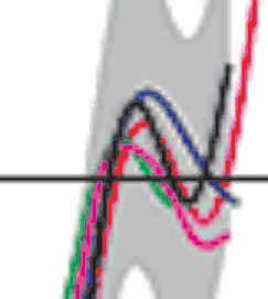
The red curve is the thermometer curve, which went up, down, and up again in the 20th century, and the blue curve is the tree-ring curve. They both turned down around 1940; the thermometers turned upward again in 1960, but the tree rings kept going down. This is the “decline” that was “hidden”, and is more formally know as the “divergence problem”. “Mike’s trick” was to – in effect – splice the actual temperatures to the reconstruction curve, to make it look like there’s no divergence. IOW, to hide the decline after 1960.
So what does it mean? It means that barring some physiological explanation, the fit is Fuldkommen Gak, and the handle arrived at by this method doesn’t mean anything. The bottom line is that the treemometers can only reproduce half of the known record, and can’t be made to fit all of it. That being the case, there’s not much reason to have faith that the handle part, which can’t be verified independently, means anything at all.
Yeah, it’s a big deal. If they could have come up with a physiological explanation, they would have. They chose not to. They chose to hide an inconvenient truth. Heh™.
Tags: Global Warming Scam